One of the important tasks in PTE Speaking is Describe Image. This is the section which directly contributes all it’s point to speaking section. Two of the crucial enabling skills which this task need is the oral fluency and pronunciations. It is very difficult to master these skills if you are not native English speaker and these skills take time, lots of efforts and practice to master. However, if you have the proper format for each type of images asked in this section, then you will be able to concur this section and achieve desire PTE score. PTE Sprinters provide all different types of formats here. Practicing with these formats will make candidate fluent and confident speaker. Go through each and every type of formats, sample audios and improve your speaking score. This article also provides a general method to use for this task and other tips and tricks.
Method:
Introduction: Introduce image by reading title and type + X- axis, Y-axis unit if needed
Body: only 2 or 3 sentences, ignore key Y-Axis
Conclusion: Conclude the image
Strategy:
- Keep it simple and cover, highest, lowest point first
- Avoid umm… uhh…
- Don’t pause for long between the sentences
- Speak with CONFIDENCE, CONVICTION AND WITH RHYTHM
- Try to read units properly and clearly
Formats for PTE Describe image:
1. Bar graph

Horizontal Bar Graph
Vertical Bar Graph
This _________ (bar graph) describes ________ (the heading/ title of the graph).
The horizontal axis represents ___________ (repeat whatever is written as description for X- axis) and
the vertical axis represents ___________ (repeat whatever is written as description for Y- axis).
The highest value of __________ (find from Y-axis, use units if given) is at __________ (value of X-axis for the highest value of Y-axis, use units if given) and it is __________ (quote the highest value). The lowest value of _________.
( similarly find from Y-axis description) is at __________ (value of X-axis for the highest value of Y-axis, use units if given) and it is _____________ (quote that highest value).
In conclusion, from the facts and figures presented in the ___________ graph, it can be inferred that ______________ (talk about the trend in a few words).
Sample audio and transcript:
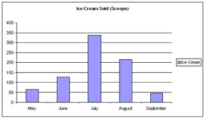
This bar graph describes Ice Cream sold in scoops. The horizontal axis represents months from May to September month and the vertical axis represents the number of scoops sold during the respective month. The highest number of Ice Cream sold in the July month and it is 340 scoops. The lowest value of Ice cream sold is in September month and it is only 50 scoops. In conclusion, from the facts and figures presented in the bar graph, it can be inferred that most ice creams sold in the July month.
2. Pie Chart
This pie chart shows the distribution of __________________ ( title of the chart) across different categories such as _________________ (read the category titles from the pie chart).
The maximum portion of the pie chart is occupied by __________________ (name the category that occupies maximum area on the pie chart) which is __________________ (read percentage of that category) and the lowest portion is occupied by ________________ (name the category that occupies minimum area on the pie chart) which is _________________ (read the percentage of that category).
__________ (category 1) occupies _____________ (read the percentage of that category) of the distribution, ______________ (category 2) occupies ________________ (read the percentage of that category) and so on for other remaining categories.
In conclusion, it can be inferred from the given facts and figures that ___________________ (talk about the general trend in a few words).
Sample audio and transcript:
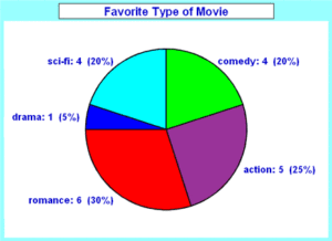
This pie chart shows the distribution of favorite type of movies across different genres such as science fiction, comedy, action, romance, and drama. The maximum portion of the pie chart is occupied by romance which is 30% and the lowest portion is occupied by drama which is 5%. Action type of movies occupies second highest which is 25% of the distribution, comedy occupies 20% and so on for other remaining categories. In conclusion, it can be inferred from the given facts and figures that romance is the most favorite type of movie category compare to others.
3. Map
The given map shows ___________________ (paraphrase title if given in question or speak whatever you think the map is about. You may also use some generic words like ‘a certain place/ a certain site’ if you don’t find any other title).
In the North direction, there is a _____________, there is a _______________ in the North East direction, a ________________ in the East direction, a _________________ in the South East, a _________________ in the South, a __________________ in the South West, a ________________ in the West and a _________________ in the South West direction. (You may not have to speak all of this as there might not be any relevant sites in some directions.)
From the geometry of the map, it is quite clear that _________________ (any visible inference, if present). (This point is optional).
Sample audio and transcript:
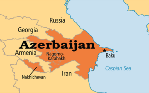
The given map shows a country called Azerbaijan. In the North direction, there is a Russia, there is a Georgia in the North East direction, the Caspian Sea is in the East direction, an Iran is in the South, a Nakhichevan is in the South West, an Armenia is in the West. Baku and Nagorno Karabakh are two major cities of Azerbaijan. From the geometry of the map, it is quite clear that Azerbaijan is surrounded by different countries from North to West to South. While Caspian Sea is at the East site.
4. Line graph
The line graph represents _________ (read title of the graph). The horizontal axis represents _______(read what presented on the x-axis, like years, months, categories). The vertical axis represents _________ (read what presented on the y-axis, like population, quantity, etc). The highest point of the graph ________ (read the unit and category). The lowest point of the graph ________ (read the unit and category). Overall/To conclude/To summarize, from the facts and figures _______(repeat the main idea/highest and lowest of the graph or one key point).
Sample audio and transcript:
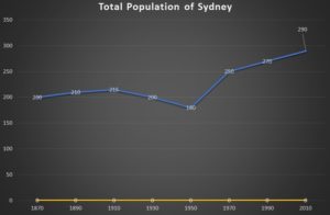
The line graph represents the total population of Sydney. The horizontal axis represents years from 1870 to 2010. The vertical axis represents populations measured in thousands. The highest number of population of the Sydney is in the year 2010. The lowest populations of the Sydney is in the year of 1950’s which is around 180 thousand. To summarize, from the facts and figures from the line graph, Sydney’s populations were highest in the year of 2010 and lowest in the year of 1950.